-
IMPACT OF GEOPOLITICAL EVENTS ON STOCK RETURN.
June 25, 2022 #012 Chart: Geopolitical Events v.s. SP500 -
MAKE INFORMED BUY AND SELL DECISION BASED ON TREND LINES.
Mar 14, 2022 #011 Chart: Top performancers ranked by Betta Index -
SPOT HOT STOCKS AND THEIR TREND ON TWITTER WITH ADVANCED AI.
Mar 3, 2022 #010 Chart: Sentiment positive % vs. Share Price $ -
USE AI AND BETTA INDEX TO SPOT HOT STOCKS ON SOCIAL MEDIA WITH SOLID FUNDAMENTALS.
Feb 26, 2022 #009 Chart: Top Reddit Small Cap Stocks Ranked Based on Betta Index -
DO STOCK SPLITS HAVE A POSITIVE IMPACT ON ITS PRICE?
Feb 21, 2022 #008 Chart: Stocks with highest split counts since year 2000 -
WHICH HOUR IN A TRADING DAY DOES THE STOCK MARKET HIT THE HIGHEST POINT?
Feb 21, 2022 #007 Chart: Stocks' average daily return% at each hour, Stocks' average daily return% at each hour in week day -
WHICH MONTHS OF THE YEAR HAVE BETTER RETURNS IN THE STOCK MARKET?
Feb 13, 2022 #006 Chart: Duration of each stock up and down cycle in days, Stocks' average monthly return% by month -
WHAT ARE THE HOT STOCKS ON REDDIT?
Feb 8, 2022 #005 Chart: Hot stocks on Reddit&Twitter with its sentiment score -
HOW MANY DAYS S&P500 CAN CONTINUE GOING UP OR DOWN?
Feb 6, 2022 #004 Chart: Duration of each stock up and down cycle in days -
WHICH DAYS IN A WEEK ARE BETTER FOR STOCKS?
Feb 2, 2022 #003 Chart: Duration of each stock up and down cycle in days -
CURRENT BEST INDUSTRIES FOR STOCK RETURN
Jan 30, 2022 #002 Chart: Industries with highest return based on 50 days return -
MOST IMPACTFUL VISIBLE PARAMETERS FOR SHARE PRICE
Jan 29, 2022 #001 Chart: Stocks with higest short percent of float

Impact of Geopolitical Events on Stock Return
Most geopolitical events had negative an impact on stock market. #012
- Yan
- June 25, 2022
- Charts
The shockwaves from both the invasion of Ukraine in February as well as the ongoing effects of COVID have changed the world on political and economic fronts. How, then, can we evaluate the impact of geopolitical events on the stock market? One way is to consider the returns in a timeframe after any particular event. If returns are still positive, then it can be assumed that there was no discernable negative effect. However, this approach fails to take into account natural appreciation as a function of time. To properly measure the effect of a geopolitical event, returns should be compared to a situation where appreciation continues unimpeded.
During the 50 years (from 1982 to 2022), there were 9% of trading days when there have been no geopolitical events happened within a time span of a year. The average annual return of the S&P500 of these trading days is an astonishing 37.42%, compared to 6.44% annual return for the trading days with economical events: 15.62% for environmental events, 5.23% for political events, and only 8.9% annual return for war events. We had illustrated the S&P500 stock return for all the six geopolitical categories in the above chart while comparing them to the same time window when no events were associated.
We published an up to date list of geopolitical events since 1972 with key market indicators (interest rate, inflation rate, jobless rate, bond yield etc) in the table of geopolitical events vs key market indicators.
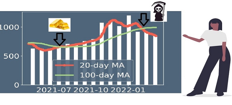
Make informed buy and sell decision based on trend lines
Stock trend lines uncovered buying and selling opportunities. #011
- Yan
- Mar 14, 2022
- Charts
How do you decide to buy or sell stock? The moving average trend line is commonly used by professionals to uncover the trending of a stock. The common moving average windows are 20, 50, 100, 200 days. We can use the combination of these trend lines to spot stock buy and sell entry points. When the shorter-window moving average like 20 days crosses above the longer-window moving average like 100 days, it can be considered as a buy entry point. This is because it indicates that the stock trend is moving up. This scenario is known as a golden cross. On the other hand, when the shorter-window moving average crosses below the longer-window moving average, it signals a sell trade, as the stock trend is shifting down. This cross is named a dead cross.
Let’s use Tesla stock as an example. Its golden cross happened around mid-July 2021 at the stock price of around $670; meanwhile, its dead cross came at the beginning of February 2022 with the stock price of $891.
We included these trend lines in our Betta Index dashboard. The white bars represented the 1-year stock price variation along the time. The red line indicated the 20-day moving average while the green line represented the 100-day moving average. Visit us at beststockindex.com to view these live charts, which will help you to make informed buy and sell decisions for your stock investment.
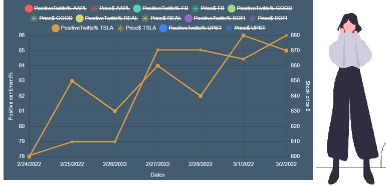
Spot hot stocks and their trend on social media with advanced AI.
Real time Twitter hot stock dashboard gives you a clear view on what's going on the market and its trend. #010
- Meng
- Mar 03, 2022
- Charts
In today's world, social media has the growing power of reflecting and influencing the financial market. Professional investors and influential business leaders are frequent Twitterers who share their insights, opinions with their followers. There are 500 million Tweets per day, it’s literally impossible to extract the most relevant information on the stocks we are interested in manually. We develop the real time dashboard to display the enriched insights from Twitters with AI for you to grasp the market trends.
We processed real-time data from Twitter to identify “hot” stocks.We engage Machine Learning algorithms for sentiment analysis, and correlating sentiment scores with movement of stock price. Our real time Twitter hot stock dashboard can uncover the current and upcoming trend of the stock price with amazing accuracy.
From 2/24/2022 to 3/2/2022, the data from our Twitter sentiment real time dashboard consistently demonstrated the $TSLA stock price climbed from the bottom $760 to $880 along with increasing positive sentiments during this period of time. Clearly there is a positive correlation between the stock price and uplifting sentiment. Further, an high sentiment score during the period of stock price drop would be a precursor for the price rebound. On 2/23/2022, $TSLA dropped 8% within one day while the sentiment score was quite high. This strong social sentiment was from a group of Tesla influencers who tweeted to advocate the Tesla investors to hold the line.
With our Twitter live sentiment dashboard for the most popular stocks, you can easily monitor those correlations and to take advantage for your investment decisions. Moreover, you can also identify the big influencers for a particular stock and get details on their insights on the market development and stock trend. Come to visit our live social media dashboard and comments table!
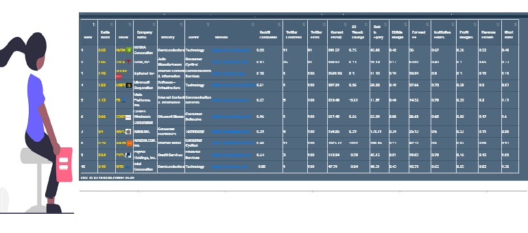
Use AI and Betta Index to spot hot stocks on social media with solid financial fundamentals.
Keep informed on the stocks hot in social media with the tables we provided without spending hours to dig yourself. #009
- Yan
- Feb 26, 2022
- Charts
Every day, there were 5 million tweets posted on Twitter and about 1 million posts on Reddit. It is next to impossible to manually spot the hot stocks mentioned in these posts. However, using Big Data analytics can put us ahead of the game.
We leveraged advanced AI technology to calculate the sentiments of hot stocks that appeared in social media. These hot stocks were checked and ranked using the Betta index which takes into account stocks’ positivity of sentiment, stock performance, company’s growth, the health of the company, and other financial fundamentals.
Our live table provides you with a live list of the hottest stocks on social media ranked based on Betta Index. Visit beststockindex.com to check out the list!
Do stock splits have a positive impact on its price?
Yes, it does! Majority of stock splits had a positive impact on its share price. Even the reversed split has one! #008
We often hear companies announce stock splits. There were reasons for them to do so due to positive impacts on stock prices. Among S&P500, the stock with the symbol ROL was ranked at the top with split 7 times since 2000, This is Rollins company started in 1948, provides pest and termite control services to residential and commercial customers. The next in line is WRB (W. R. Berkley, an insurance company, founded in 1967), ATVI (Activision Blizzard, the company owns Candy Crash game), ODFL(Old Dominion Freight Line, who operates trucks in the United States and North America, established in 1934). Among these top four companies, ODFL is the only one that significantly outperformed the S&P500 average return in the last 5 years by about 280%.
On the top splitter list since 2000, we can find Marriott (5 times), Nvidia (5 times), Ebay (4 times), and Apple (4 times). For stocks in S&P500 did not have any split, they had 0.86% monthly average return since 2000. The stocks with split action had a 1.11% average monthly return. Surprisingly, the stocks with reverse split almost had doubled the return of the stocks without any split, its monthly average return reached 1.55%. At the high end, when the accumulative split ratio is higher than 10, especially with a high split ratio equal or higher than 4 at each split, we would start seeing a stunning higher monthly return for these stocks.
Come to visit our below live charts at beststockindex.com to uncover these hidden patterns.
Which hour in a trading day does stock market hit the highest point?
The pattern observed in Feb 2022 with 2 years' S&P 500 trading data: It revealed the market would usually reach its highest price point around the noontime (US Eastern Time). The last hour of the trading day usually was the worst hour in the day. If you bought a stock at the end of the previous trading day, the average difference in daily return would be 0.016% if you sold the stock at noon compared to selling it at the last hour of the trading day.On average, Friday lost to the rest of days in the week for the daily return in each hour; its only exception is the last trading hour of the day (2 to 3 PM EST). The reason might be that some of the traders would need to buy back stocks to close out or cover the short positions or options.
As we mentioned in previous blogs, although Tuesdays would have higher chances for the stock market going down, it would have higher returns if it did go up. For each hour in the day, Tuesdays outperformed the rest days in the week.
The pattern observed in June 2022 with 2 years' S&P 500 trading data: Both 11AM and 2PM US EST won in terms of reaching its highest stock price for the market. Tuesdays now had the highest return if you bought stocks a day earlier and sold it next day.
Since these patterns change over time, it needs to be monitored based on the most recent market data. You can use the charts below on beststockindex.com to get the most up-to-date patterns and insights on the market’s hour pattern with the latest data from the market.
Would it surprise you? The pattern is not fixed! #007
We studied the latest 2 years' S&P 500 hourly data. The daily return was calculated between the index price at each hour in the trading day and the index closing price of the previous trading day. The patten kept on changing:
As we mentioned in previous blogs, although Tuesdays would have higher chances for the stock market going down, it would have higher returns if it did go up. For each hour in the day, Tuesdays outperformed the rest days in the week.
Since these patterns change over time, it needs to be monitored based on the most recent market data. You can use the charts below on beststockindex.com to get the most up-to-date patterns and insights on the market’s hour pattern with the latest data from the market.
Which months of the year have better returns in the stock market ?
Summer months are more stable than other months in the year based on our 5 year S&P data. #006
Which months of the calendar have the best stock market returns? To answer this, we first looked at the number of upcycles and number of down cycles in each month for S&P 500 in the past 5 years. We noticed that 6-to-8-day-long cycles, which usually happened once or twice a year, all happened in the first five months of the year.
April is the month with the highest average return of 5.66%, mainly due to the high monthly return of 17.89% in 2020. In the months of November and three summer months (June, July, Aug), the market usually go up with more consistent good average monthly return than other months in the year. Their average monthly return were all above 2%.
March of -3.24% is the worst month in a year. Its main contributor was March 2020 with a monthly average drop of -16.36%. February and September were the two months pretty bad for the investment.
December is where Santa Claus Rally resides. It was dragged by December 2018 when the market dropped -10.16% in that month. Otherwise, December is usually a happy month for investors who can experience an average 2.5% plus monthly return.
We would like to point out that January 2022 that we just witnessed was the worst January in 5 years with -5.86% drop in a month on average. You probably would feel much more drop if you owned many tech stocks. These patterns are never set in stone. Visit us at beststockindex.com for live updates on stock market patterns and insights.
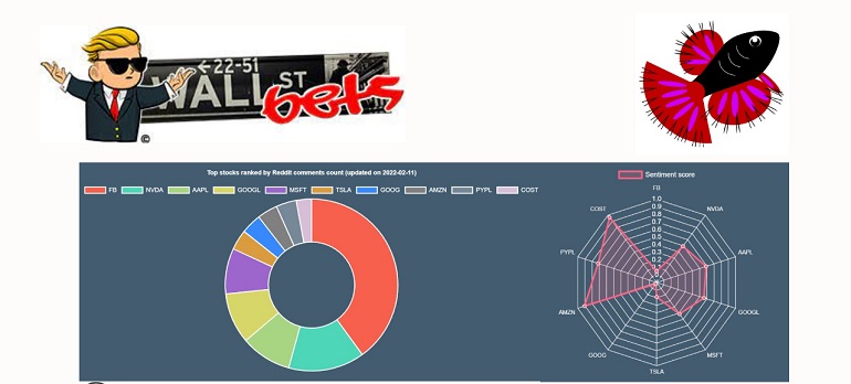
What are the hot stocks on Reddit?
We used advance AI/NLP technology to spot for you! #005
- Meng
- Feb 8, 2022
- Charts
The phrase “To the Moon!” nowadays is likely not referring to the Apollo program; rather, it is now used more commonly to refer to recent AMC and GME stock trends. Wall Street analysts give the stock price target based on the valuation model, but the short-term price is more associated with how people think it should be.
To get investors’ sentiments, we monitored the data from Reddit on a daily basis, which covered 11-millions-subscribers on Reddit along with other major financial subreddits. We are sure you still remember the epic short squeeze on GME by Wallstreetbets last year and how powerful a social platform can be. Thus, we have developed advanced NLP algorithms to remove the noises and focus only on key information associated with the stock/asset prices fluctuation.
Our algorithm automatically identified the top 10 hottest large-cap stocks, top 10 meme stocks, and their comprehensive sentiment score in real-time. We hope these analytics can help users quickly spot what is “hot” in the market. We would like to empower you to make swift and smart investment decisions. Who has time to read all the posts to understand the market? Let our Social media sentiment analytics dashboard bring insight to you!
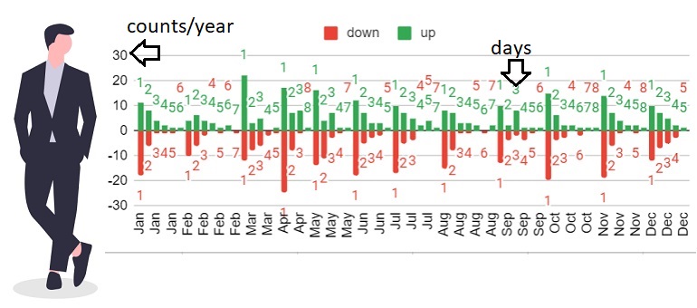
How many days S&P500 can continue going up or down?
We studied the last 5 year's data, the longest duration for up trend is 8 days while 7 days for the down trend. #004
The NYSE and NASDAQ has about 252 to 253 trading days on average in a year. The good news is, from our study of the last 5 years' S&P500 stock index data, the market went up about 56.5% of the trading days. The longest duration for continuous market growth was 8 days, which has happened only 3 times in the last 5 years with the most recent one happening from Oct 27th, 2021 to Nov 8th, 2021. Meanwhile, the longest continuous bear market was 7 days, which has happened only once in the last 5 years, from February 19th, 2020 to February 28, 2020.
For an uptrend, a 3-day uptrend happens once a month on average, while 3-day downtrend occurs approximately half as often. Furthermore, a 4-day uptrend happens on average once a quarter, while 4-day downtrends also occur half as often.
2022, however, bucks this trend. This year alone, we have seen one 4-day upcycle from January 27 to February 2nd in 2022, but we have also seen one 3-day down cycle, one 4-day down cycle and one 5-day down cycle in just January alone. Looks like 2022 would be a year to break normal patterns. We will keep on monitoring the market dynamics and trend changes on our live charts below.
Which days in a week are better for the stock market?
The answer varied with the time window you will look at. Some days in a week had some consistent pattern that we would need to know. #003
Not every day of the week provides the same investment return; indeed, some days are better than others at predicting whether the market will go up and down. Analysis of a time window of the past 5 years, 2 years, 1 year, 6 months and 3 months reveals that there is a much higher chance for market to go down on Tuesdays. In addition, Tuesday has a down trend of decreased daily returns although it is still high compared to other days in the week when considering different time windows. For the most recent 3 months, Tuesday average daily returns also dropped from 0.09% to -0.02% in 5 years. On the other hand, Monday showed a trend of increasing daily returns with 0.35% in the latest 3 months, while its value was 0.06% during the 5 year time window. This pattern might change based on overall market condition, and we will continue monitoring the pattern with the below live charts.
Current best industries for stock return
Oil&Gas E&P and Equipment & Service companies have been consistently outperforming other industries in both investment time windows.
Regional Banking still had high returns, but it lost its top 1 position in the 50 days’ time window as compared to the 200 days’ investment time window.
Retail, Utilities and REIT (Real Estate Investment Trust) have now fallen out of the top investment return industry list in the 50 days’ time window.
We will keep on monitoring the changes with the below live charts.
The industries stock market favors changes along time. #002
What industries are the hottest to invest in right now? The answer to this question is constantly changing with the market as technologies develop and politics unfurl over time. To see what industries to invest in, we studied the number of companies in top industries in S&P500 with their stock return ranked at the top 25 percentile. We compared the difference between two investment time windows: 50 days and 200 days. As of the time we wrote this blog (01-30-2022), here are the main observations:
We will keep on monitoring the changes with the below live charts.
Most impactful visible parameters for share price
There are no strong correlations between the stock returns and any of these financial parameters.
fiveYearAvgDividendYield had the most statistically significant positive correlation with a correlation coefficient of 0.18 and p-value of 0.0007, much more significant than any widespread standard of statistical significance. Note that the correlation is both weak and significant; that is, we are confident that this parameter can affect stock prices, but only by a small amount.
shortPercentOfFloat (the percentage of a company's publicly available stock that has been shorted by institutional traders), on the other hand, was the most statistically significant negative correlation with a correlation coefficient of -0.19 and a p-value below 0.0001. The median of shortPercentOfFloat for the S&P500 was 1.74%, while the highest individual value found was 16.22%.
Interestingly enough, revenueGrowth has a -13% negative correlation with stock return with 0.0036 p-value, likely due to rising interest rates.
We would also like to point out that the average value of shortPercentOfFloat among the top 10 performers based our betta index is 2.5%. As of the date of this post, the top three stocks with the highest shortPercentOfFloat are: DISCA (Discovery ) with 16.2%, AAL (American Airlines) with 14.9% and WHR(Whirpool) with 13.7%.
Insights on short percent of float shares #001
We all know there are many factors driving stock price fluctuations, such as the Federal Reserve’s policy, the overall health of the market, and the specific industry or company news related to the stock. These factors are hard to predict, so we decided to instead look at stocks’ financial performance parameters:
We would also like to point out that the average value of shortPercentOfFloat among the top 10 performers based our betta index is 2.5%. As of the date of this post, the top three stocks with the highest shortPercentOfFloat are: DISCA (Discovery ) with 16.2%, AAL (American Airlines) with 14.9% and WHR(Whirpool) with 13.7%.